Match your baby's bedding and cot linen in style
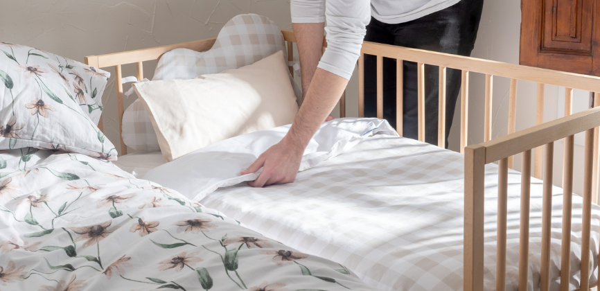
If you have a baby who sleeps in a co-sleeping cot next to your bed, we suggest that you combine the textiles of both with your own style and personality.
Instead of having a messy or unaesthetic room, you can simply choose bedding that matches or complements each other - you'll see how great it looks!
Dress up your bed and crib in style and the result will be truly amazing. Try to promote calm, beauty and order in your shared room, even if it's only temporary. Are you up for it?
If you follow our tips on colour palettes or patterns that go well together, you'll have an easier time - guaranteed!
The simplest option: opt for the same light tones.
One way to get it right without taking too many risks is to opt for a light or neutral-coloured textile for both beds, with some subtle touches of colour to match the room's décor.
If you choose a beige or sand-coloured duvet cover and a crib linen in the same colours with some children's motifs in other tones, the mix will look great and the atmosphere will be harmonious and elegant.
However, if you like to have printed or brightly coloured bedding, you can also achieve successful combinations.
Some colour palettes that complement each other well
You can always find examples of perfectly matching colour palettes on the most inspiring social networks, such as Instagram or Pinterest, but today we are going to give you some concrete examples.
White, lilac, aquamarine green, light blue and grey are all colours that go very well together.
If you look at this duvet cover from our new Moons collection, it features these trendy shades that are light and promote calmness, essential for children's sleep.
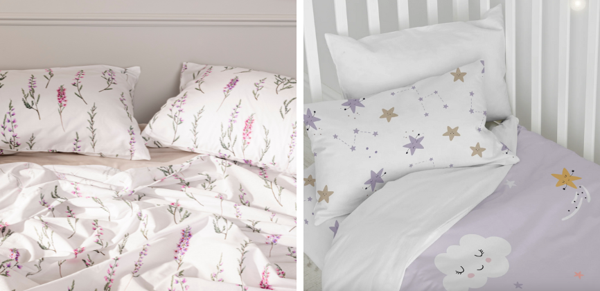
This type of cot linen can be combined with a bedding that has one of the aforementioned colours as the dominant colour.
Lilac, for example, is very spring-like and will look great in your room. You can also opt for a duvet cover from our Basic line in beige or grey and then place a plaid or blanket in lavender or light green on top.
Another palette that combines great is the one that includes warm colours such as mustard or terracotta, with other minerals such as greens, greys and blues.
You can also go for a trendy orange or terracotta red with light brown, beige or a light pink. What do you think?
Mixing prints: squaring the circle
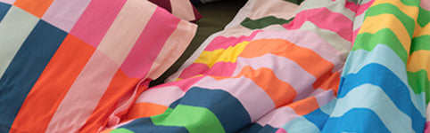
The riskiest thing is always to mix prints, but nowadays it is very fashionable to do it with home textiles. In our online shop you will see hundreds of photos where there is a mixture of colours, patterns and motifs.
Don't be afraid to combine prints, because if you respect a chromatic harmony, the result will be dazzling.
Apart from the power of colour to induce certain moods, prints also cheer you up, cheer you up, convey tranquillity... Use them to your advantage!
In addition, in this season, it is much more appealing to opt for graphic motifs, both in clothes and in the textiles of our rooms.
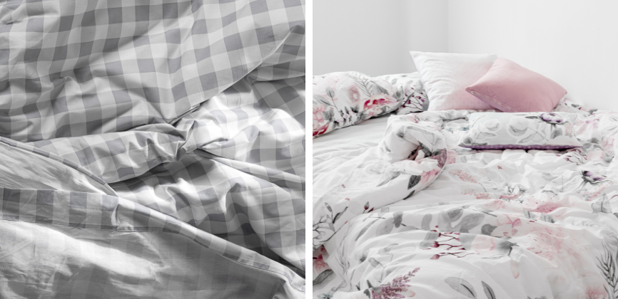
One of the trendiest mixes is plaid and flowers. You will have noticed it in our photos, won't you?
Combining some of our Vichy check designs for children's beds with other floral prints for adult beds, always in the same or complementary tones, will be ideal in your family bedroom.
It's also very popular to combine plaids and stripes in different colours and thicknesses, as well as floral prints on sheets or duvets with geometric cushion covers.
Many of our latest designs for the adult bedroom include these successful combinations on sheets, duvet covers and cushion covers - you'll see!